NBA球员投篮数据可视化

源 /法纳斯特 文 /小F
最近看了有关于NBA球员出手数据的可视化案例,个人感觉比较有趣,所以想着自己也来实现一波。总体上来说差不多,可能就是美观点吧...
/ 01 / 篮球场
从网上找的篮球场尺寸图,如下。

其中单位为英尺,NBA的球场尺寸为94英尺长,50英尺宽。
下图是我用CAD绘制半场尺寸图,本次绘图就是按照下面这个尺寸来的。

有了尺寸,接下来就可以使用matplotlib进行绘制篮球场了。
主要是绘制矩形、圆形以及圆弧。
具体代码如下。
# 对篮球场进行底色填充lines_outer_rec = Rectangle(xy=(-250, -47.5), width=500, height=470, linewidth=lw, color='#F0F0F0', fill=True)# 设置篮球场填充图层为最底层lines_outer_rec.set_zorder(0)# 将rec添加进axax.add_patch(lines_outer_rec)
# 绘制篮筐,半径为7.5circle_ball = Circle(xy=(0, 0), radius=7.5, linewidth=lw, color=color, fill=False)# 将circle添加进axax.add_patch(circle_ball)
# 绘制篮板,尺寸为(60,1)plate = Rectangle(xy=(-30, -7.5), width=60, height=-1, linewidth=lw, color=color, fill=False)# 将rec添加进axax.add_patch(plate)
# 绘制2分区的外框线,尺寸为(160,190)outer_rec = Rectangle(xy=(-80, -47.5), width=160, height=190, linewidth=lw, color=color, fill=False)# 将rec添加进axax.add_patch(outer_rec)
# 绘制2分区的内框线,尺寸为(120,190)inner_rec = Rectangle(xy=(-60, -47.5), width=120, height=190, linewidth=lw, color=color, fill=False)# 将rec添加进axax.add_patch(inner_rec)
# 绘制罚球区域圆圈,半径为60circle_punish = Circle(xy=(0, 142.5), radius=60, linewidth=lw, color=color, fill=False)# 将circle添加进axax.add_patch(circle_punish)
# 绘制三分线的左边线three_left_rec = Rectangle(xy=(-220, -47.5), width=0, height=140, linewidth=lw, color=color, fill=False)# 将rec添加进axax.add_patch(three_left_rec)
# 绘制三分线的右边线three_right_rec = Rectangle(xy=(220, -47.5), width=0, height=140, linewidth=lw, color=color, fill=False)# 将rec添加进axax.add_patch(three_right_rec)
# 绘制三分线的圆弧,圆心为(0,0),半径为238.66,起始角度为22.8,结束角度为157.2three_arc = Arc(xy=(0, 0), width=477.32, height=477.32, theta1=22.8, theta2=157.2, linewidth=lw, color=color, fill=False)# 将arc添加进axax.add_patch(three_arc)
# 绘制中场处的外半圆,半径为60center_outer_arc = Arc(xy=(0, 422.5), width=120, height=120, theta1=180, theta2=0, linewidth=lw, color=color, fill=False)# 将arc添加进axax.add_patch(center_outer_arc)
# 绘制中场处的内半圆,半径为20center_inner_arc = Arc(xy=(0, 422.5), width=40, height=40, theta1=180, theta2=0, linewidth=lw, color=color, fill=False)# 将arc添加进axax.add_patch(center_inner_arc)
# 绘制篮球场外框线,尺寸为(500,470)lines_outer_rec = Rectangle(xy=(-250, -47.5), width=500, height=470, linewidth=lw, color=color, fill=False)# 将rec添加进axax.add_patch(lines_outer_rec)
returnaxaxs = draw_ball_field(color='#20458C', lw=2)
# 设置坐标轴范围axs.set_xlim(-250, 250)axs.set_ylim(422.5, -47.5)# 消除坐标轴刻度axs.set_xticks([])axs.set_yticks([])# 添加备注信息plt.annotate('By xiao F', xy=(100, 160), xytext=(178, 418))plt.show
最后得到下图。

下面去获取球员的投篮数据。
/ 02 / 投篮数据
投篮数据来源于NBA官方网站——NBA Stats。

在这个网页下打开开发者工具,找到下面这个请求。

便能获取到球员的投篮数据,本次只获取球员的投篮点及是否得分的数据。
这里以「库里」为例,爬取代码如下。
headers = {'User-Agent': 'Mozilla/5.0 (Windows NT 6.1; WOW64) AppleWebKit/537.36 (KHTML, like Gecko) Chrome/63.0.3239.132 Safari/537.36'}
# 球员职业生涯时间years = [2018, 2019]fori inrange(years[0], years[1]):# 赛季season = str(i) + '-'+ str(i + 1)[-2:]# 球员IDplayer_id = '201939'# 请求网址url = 'https://stats.nba.com/stats/shotchartdetail?AheadBehind=&CFID=33&CFPARAMS='+ season + '&ClutchTime=&Conference=&ContextFilter=&ContextMeasure=FGA&DateFrom=&DateTo=&Division=&EndPeriod=10&EndRange=28800&GROUP_ID=&GameEventID=&GameID=&GameSegment=&GroupID=&GroupMode=&GroupQuantity=5&LastNGames=0&LeagueID=00&Location=&Month=0&OnOff=&OpponentTeamID=0&Outcome=&PORound=0&Period=0&PlayerID='+ player_id + '&PlayerID1=&PlayerID2=&PlayerID3=&PlayerID4=&PlayerID5=&PlayerPosition=&PointDiff=&Position=&RangeType=0&RookieYear=&Season='+ season + '&SeasonSegment=&SeasonType=Regular+Season&ShotClockRange=&StartPeriod=1&StartRange=0&StarterBench=&TeamID=0&VsConference=&VsDivision=&VsPlayerID1=&VsPlayerID2=&VsPlayerID3=&VsPlayerID4=&VsPlayerID5=&VsTeamID='# 请求结果response = requests.get(url=url, headers=headers)result = json.loads(response.text)
# 获取数据foritem inresult['resultSets'][0]['rowSet']:# 是否进球得分flag = item[10]# 横坐标loc_x = str(item[17])# 纵坐标loc_y = str(item[18])withopen('curry.csv', 'a+') asf:f.write(loc_x + ','+ loc_y + ','+ flag + 'n')
获取到的数据如下。

其中可以通过设置球员ID以及赛季时间来获取不同的数据。
球员ID和赛季时间可以通过官网中的球员信息网页了解到。
/ 03 / 数据可视化
现在球场有了,投篮数据也有了,就可以来画图了。
使用matplotlib的散点图来实现。
# 读取数据df = pd.read_csv('curry.csv', header=None, names=['width', 'height', 'type'])# 分类数据df1 = df[df['type'] == 'Made Shot']df2 = df[df['type'] == 'Missed Shot']# 绘制散点图axs.scatter(x=df2['width'], y=df2['height'], s=30, marker='x', color='#A82B2B')axs.scatter(x=df1['width'], y=df1['height'], s=30, marker='o', edgecolors='#3A7711', color="#F0F0F0", linewidths=2)
得到下图。
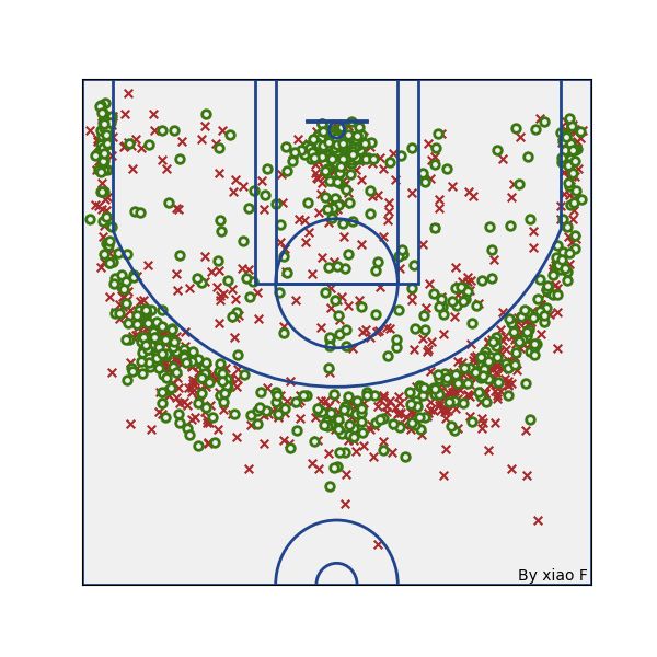
来和官网的图对比一下。
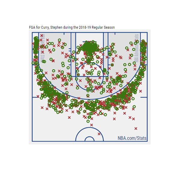
看起来还不错,匹配度还是蛮高的。
下面绘制投篮热力图,通过seaborn绘制,代码如下。
# 读取数据df = pd.read_csv('curry.csv', header=None, names=['width', 'height', 'type'])
defcolormap:"""颜色转换"""returnmpl.colors.LinearSegmentedColormap.from_list('cmap', ['#C5C5C5', '#9F9F9F', '#706A7C', '#675678', '#713A71','#9D3E5E', '#BC5245', '#C86138', '#C96239', '#D37636', '#D67F39', '#DA8C3E', '#E1A352'], 256)
# 绘制球员投篮热力图shot_heatmap = sns.jointplot(df['width'], df['height'], stat_func=None, kind='kde', space=0, color='w', cmap=colormap)# 设置图像大小shot_heatmap.fig.set_size_inches(6, 6)# 图像反向ax = shot_heatmap.ax_joint# 绘制投篮散点图ax.scatter(x=df['width'], y=df['height'], s=0.1, marker='o', color="w", alpha=1)# 添加篮球场draw_ball_field(color='w', lw=2)# 将坐标轴颜色更改为白色lines = plt.gcalines.spines['top'].set_color('none')lines.spines['left'].set_color('none')# 去除坐标轴标签ax.axis('off')
得到结果如下。

还是来看一下官网的图。

两个效果都不错,不过边框我没调好,显得没那么好看。
库里投篮最密集的区域,篮下和三分线。
最后看一下于小F而言,印象比较深的球员,「科比」和「霍华德」。
「科比」的ID为977,职业生涯时间为1996年到2012年。
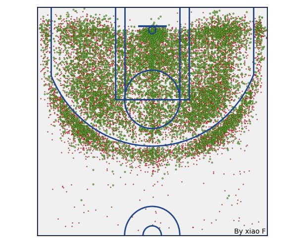
全线开花,不少负角度投篮,甚至还有超远三分。
「霍华德」的ID为2730,职业生涯时间为2004年到2019年。

魔兽霍华德,屈指可数的三分。
其他都是围绕着篮板的得分。

还有好多球员,就靠大伙自己去看啦!
/ 04 / 总结
好了,本次更文到此结束。
感兴趣的小伙伴可以自行动手,操作一波。
这个夏天NBA总是能爆出大新闻。

转载声明:本文选自「法纳斯特」。 返回搜狐,查看更多
责任编辑: